ONE ROOM CHALLENGE WEEK 6 - REVEAL DAY!
Hello friends! Reveal day is finally here and wow, has it been a fun and rewarding ride! Many thanks again to Linda from Calling it Home and Better Homes and Gardens for this design challenge. It’s so funny how the universe works, I decided to participate in this challenge because I needed to get back to blogging and kick start my creative juices again. Throughout the challenge, my husband (Mr. PLD) and kids joined in on the process, so pulling the room together became less about me and more about working along side them. Mr. PLD was my my photographer and took on all the major paint projects in the space. While my son was my extra eyes when it came to my DIY painting and also assisted us with all the prep work related to the fireplace.
The last six weeks have been consumed with everything One Room Challenge from multiple paint runs, to DIY projects, to de-cluttering, to sanding, styling, priming, editing styling and editing some more. Need a full recap of the last couple of weeks? You can check out my progress from Week One, Week Two, Week Three, Week Four and Week Five posted previously on the blog. Now for the BEFORE and AFTER shots.
BEFORE..
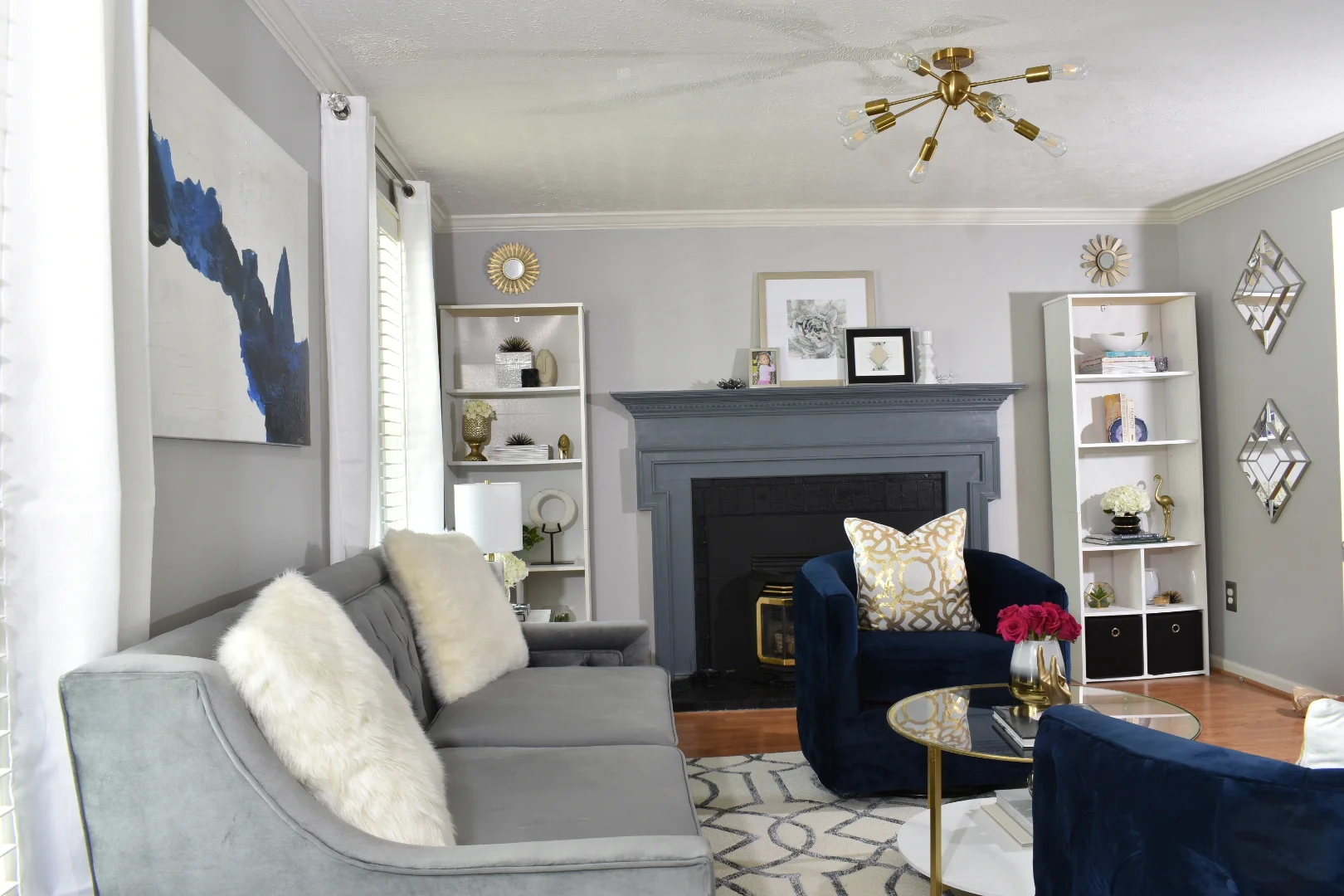
To the AFTER shots…
The furniturE
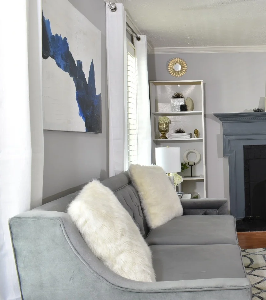
Our new sofa now comfortably seats three adults (or four kids), while our old sofa only sat two adults (or three kids). Our new swivel chairs are now front and center in the space so they encourage you to sit down versus before our side chairs were buried under clutter so no one was able to sit in them.
the lighting
Our front porch (which I love by the way) creates a shadow in our living room, so I knew that I wanted to add two new bright sources of lighting to the space. I don’t have a before picture of the lighting but, it was the standard builder ceiling light fixture. The sputnik light that I found on Amazon is now the statement jewelry piece of the room. I also added a table lamp to the nesting tables beside the sofa.
The art
For the art over the sofa, I knew I wanted a large abstract piece that would speak to the blue accent chairs in the space. I painted this piece with the help of my son at the last hour of the One Room Challenge and I am pretty happy with the results. I haven’t named this piece yet, but some may think it resembles an abstract version of a mountain and my son thinks it looks like water flowing across the canvas. What do you see? The art on the fireplace were pieces that I found at one of my favorite stores, ‘At Home’.
the fireplace
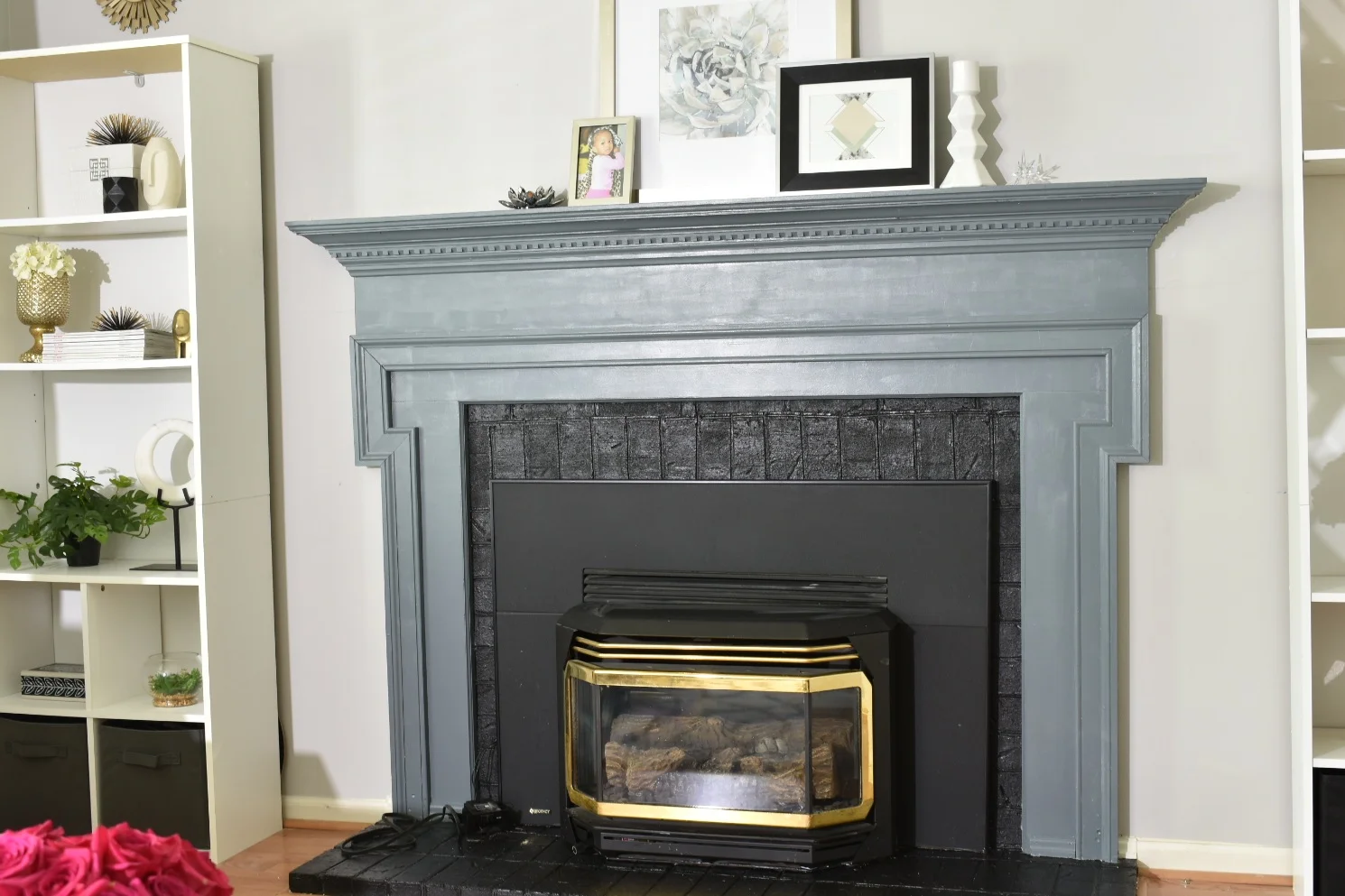
The fireplace is one of the biggest transformations in the the space because the paint completely changes the look and feel in the room. Before when we walked into the room, the wooden mantel and red brick screamed “Hello you over there!!!” while now, the fireplace fits cohesively with the design. My contractor cut down the size of the shelf of the mantel which helped scale it down and Mr. PLD painted both the fireplace mantel and brick surround. Painting the fireplace was a “labor of love” and it required several coats of primer before we painted it. My original plans for the fireplace were to paint the brick white but we decided at the last minute, to paint it black. We realized that because the black fireplace insert dominated the brick so much, that we could just paint the brick the same color so that everything would blend nicely together. If you look closely at the brick, you’ll notice all the imperfections but I like the character that they bring to the space so it doesn’t bother me as much as I thought it would!
the details
Last but certainly not least are the details! Now you know I couldn’t forget to mention the design details that truly bring life to any space. Don’t be afraid to personalize your accessories with fun and unexpected pieces. Pieces that were either collected following your travels, family pictures and quirky collectible items that will still fit in with your color scheme. The golden hand signing the “I love you” sign is a small tradition that my husband started that we often do right before bed with the kids or for example across the soccer field for encouragement. And last but not least, don’t forget to bring life to your space with lush plants and flowers. Don’t have a green thumb? Invest in beautiful faux floral and plants.
So that is all my friends! This design challenge was a wild ride but one that I am glad I chose to ride! It challenged me as a designer, I got to work along side some of my favorite people and at the end of the 6 weeks I felt pretty damn accomplished. (Sorry Mom!) Thank you to everyone for following along on this journey with me and for all the support from my new and old friends!
Week One, Week Two, Week Three, Week Four and Week Five
Be sure to check out all the other featured designers and the other guest designers inspiring spaces. Drop a note, tell me what you think and let me know if you’d like to know more about the sources in the space?
#BHGORC #OneRoomChallenge #ORC @prettylovesdetails


